What Colour Splashback Goes With a Cashmere Kitchen?

Discovering the perfect colour harmony for your kitchen can elevate the overall aesthetic of the space to a new level.
If you've chosen a cashmere kitchen, you already have a great foundation.
Now, the challenge is to find the right splashback colour that would enhance and complement this luxurious cashmere tone.
In this blog post, we will guide you through a variety of appealing splashback colour options to pair with your cashmere kitchen, turning your space into a symphony of colours that's not only visually pleasing but also reflects your personal style.
Click here to see our Alusplash splashback range.
What Colour Splashback Goes With a Cashmere Kitchen?
The choice of splashback colour can significantly impact the overall look and feel of your kitchen, and when it comes to cashmere kitchens, the elegance and versatility of the cashmere hue offer a broad spectrum of options.
Ranging from subtle, neutral tones to bold, vibrant colours, here are a few options for you to consider:
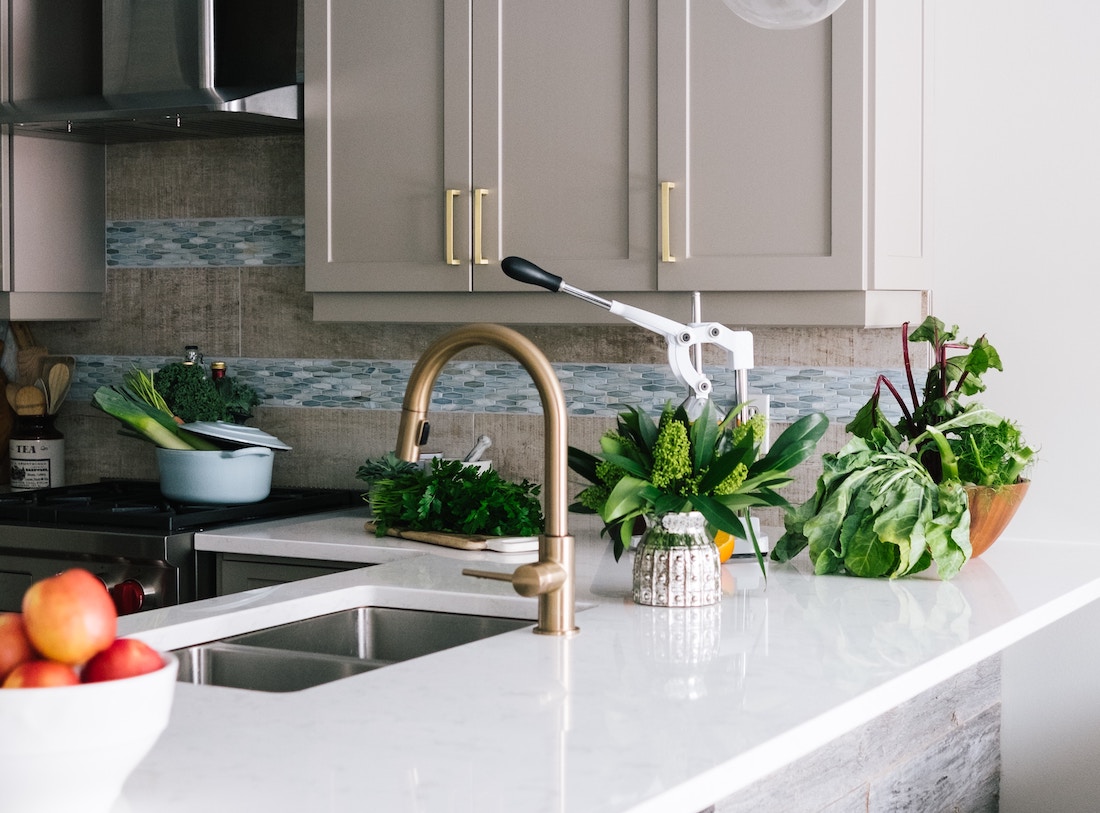
- White: A white splashback in a cashmere kitchen creates a fresh, airy, and classic feel. This combination is timeless and can make your kitchen appear larger and more open. Opt for different finishes, from gloss to matte, or even textured tiles for added interest.
- Greys: Various shades of grey can beautifully complement a cashmere kitchen. Lighter grey can create a soft, seamless look, while darker, charcoal grey can provide a striking contrast, making the cashmere units stand out.
- Blush Pink: If you want a subtle touch of colour, consider a blush pink splashback. This soft, warm hue will pair elegantly with cashmere, creating a modern and sophisticated aesthetic.
- Cashmere: For a monochrome look, opt for a cashmere-coloured splashback. This seamless, uniform look brings about a sophisticated and sleek appearance. Play with textures or patterns to avoid the space looking flat.
- Black: Black and cashmere create a high-contrast, contemporary look. The black splashback can make the cashmere units pop and add a dramatic flair to your kitchen.
- Muted Greens or Blues: Muted green or blue hues, such as sage or duck egg blue, can bring a calming, natural feel to a cashmere kitchen. These colours offer a cool contrast to the warm undertones of cashmere and bring a sense of tranquillity to the space.
- Rich, Jewel Tones: Deep, rich colours like emerald green, sapphire blue or ruby red can create an eye-catching contrast against the soft, neutral backdrop of a cashmere kitchen. This choice makes for a bold, statement splashback that can become the focal point of the kitchen.
- Metallics: Metallic splashbacks such as bronze, copper, or gold can add warmth and a touch of luxe to a cashmere kitchen. The reflective properties of these surfaces will also add light and depth to the room.
- Marble Effect: A marble-effect splashback can bring a touch of luxury and sophistication to a cashmere kitchen. The veining can introduce additional subtle colours and textures to the room.
- Wood Effect: For a warm, rustic feel, consider a wood-effect splashback. This can provide a striking contrast against the smooth, contemporary finish of cashmere units.
Remember, when selecting the colour of your splashback, you should consider the overall style of your kitchen, the amount of natural light the room gets, and the colour of your countertops and appliances.
You may also want to think about how easy the splashback material is to clean and maintain.
It's always a good idea to get samples and test different colours in your kitchen under different lighting conditions before making a final decision.
The perfect splashback colour will not only complement your cashmere kitchen but also reflect your personal style and taste.
Related Post: What Colour Splashback Goes With A White Kitchen

Where Does the Colour Cashmere Come From?
The term "cashmere" as a colour has been borrowed from the fine, luxurious textile that comes from the cashmere goat.
This natural fibre is famed for its exceptional softness and warmth.
The colour of untreated cashmere wool typically ranges from white to a soft, light beige or grey, and it's this gentle, warm hue that we often refer to as 'cashmere' in the context of colour.
In interior design and particularly in kitchen design, 'cashmere' is a popular colour choice.
It's a soft, neutral hue with warm undertones, offering more depth and warmth than white or cream but remaining very versatile.
This colour exudes an understated elegance and can seamlessly blend with various design styles, making it a favoured choice for cabinets, walls, and accessories.
Related Post: How To Remove A Glass Splashback Without Breaking ItWhy Splashbacks Are an Important Part of a Kitchen's Colour Scheme
Splashbacks play a pivotal role in the overall colour scheme and design of a kitchen.
They have moved beyond being purely functional elements that protect your walls from splashes and spills and have become major design features that have the power to either subtly complement or dramatically transform the aesthetic of your kitchen.
Here's why splashbacks are an integral part of a kitchen's colour scheme:
- Colour Balance: Splashbacks can help to balance or enhance the colour scheme of a kitchen. For example, a well-chosen splashback can complement your kitchen cabinets or countertops, creating a harmonious look. Alternatively, it can provide a striking contrast, adding interest and depth to your colour scheme.
- Visual Interest: A splashback is a great opportunity to add visual interest to your kitchen. A colourful or textured splashback can be an eye-catching feature that draws the eye and becomes a focal point in the kitchen.
- Reflection of Light: Splashbacks, especially glossy or metallic ones, can reflect light, making the kitchen appear brighter and more spacious. This can also subtly impact the colour dynamics of the space, especially under different types of lighting.
- Style Statement: The colour of your splashback can make a statement about your kitchen's style. For instance, a bright, bold splashback might suggest a fun, contemporary kitchen, while a neutral or natural material splashback could indicate a more traditional or minimalist design.
- Mood Enhancer: Colours have a psychological effect on our mood. The colour of your splashback can help create a desired atmosphere in your kitchen, from calming and soothing to vibrant and energising.
- Tie the Room Together: If you have an open-plan living space, the colour of your kitchen splashback can tie in with the rest of the decor, helping to visually connect the different areas and create a cohesive look and feel across the space.
As such, when planning your kitchen's colour scheme, don't overlook the potential impact of your splashback.
It's a chance to be creative and express your personal style, whilst adding a practical feature to your kitchen.
Some Notes from an Expert Kitchen Fitter and Manufacturer
As an expert kitchen fitter with years of experience in the industry, I've seen a wide variety of kitchen styles and colours come and go over the years.
From a practical perspective, the warm, neutral colouring of cashmere is very forgiving.
It's light enough to keep the kitchen feeling open and airy, but has more depth and warmth than white, making it great at hiding minor marks that are inevitable in a busy kitchen.
From a design perspective, the soft, warm tone of cashmere gives an ideal base that blends well with lots of colours.
Whether it's paired with a rustic wood finish for a country-style kitchen, combined with sleek black or metallic accents for a modern look, or used in a classic, traditional kitchen design, cashmere never fails,.
In terms of colour pairing, cashmere is equally versatile.
It complements a wide range of colours, allowing for both harmonious and contrasting colour schemes.
Another aspect I love about cashmere kitchens is the ability to adapt to changing trends.
As trends evolve, the neutral, elegant base of a cashmere kitchen can easily be updated with different accents, splashback colours, and accessories.
This makes cashmere a smart, long-term choice for those who like to keep their kitchen up-to-date with minimal fuss.
So, based on my experience as a kitchen manufacturer and fitter, I like cashmere kitchens for their elegance, adaptability, practicality, and versatility in colour pairing.
Whether for a modern or traditional kitchen, cashmere is a choice that you'll enjoy for years to come.
Final Notes On What Colour Splashback Goes Well With a Cashmere Coloured Kitchen
Choosing the right splashback colour for a cashmere kitchen can truly transform and elevate the overall aesthetic of your space.
From the elegance of white or the drama of jewel tones, the myriad options available provide the flexibility to create a harmonious and inviting kitchen environment that suits your personal taste.
It can balance the kitchen's colour palette, create visual interest, reflect light, make style statements, enhance the mood, and tie the room together.
The beautiful colour cashmere, inspired by the soft and luxurious textile, offers a sophisticated and versatile base for your kitchen decor.
So, as you decide on the splashback for your cashmere kitchen, remember to consider the overall style, the amount of natural light, and the other elements in your kitchen.
Don't be afraid to experiment with samples and test different colours under various lighting conditions.

